Inside The Data
EDGE Class: Athleticism Vs. Production
With the NFL Draft approaching this month, I looked at the top prospects from all positions groups and measured their athleticism and production, using scatter charts to compare their profiles to other players at their position in this year’s draft, along with first-round picks from their position in the past four drafts, and top-100 picks at their position from the past four drafts.
In each scatter chart, the colored horizontal line represents the average score of college production from the prospect position group. The intersecting vertical line represents the average score of athletic testing of the prospect position group.
and will continue with interior defensive line, off-ball linebacker, cornerback and safety before moving to offense.

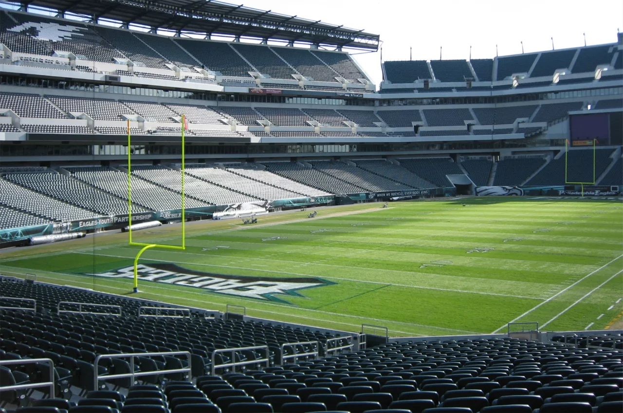
GETTY IMAGES: Abdul Carter’s testing and production show why he’s a potential top-3 pick.
You can hear my podcast version with Geoff Mosher on all Inside The Birds podcast platforms.
This first scatter chart shows how the top prospects of this year’s EDGE class compare to all EDGE prospects for this year’s draft whose data was available.
Note that Penn State’s Abdul Carter and Boston College’s Donovan Ezeiruaku fall into the highest level of the upper right quadrant, which is the “blue chip” quadrant where prospects are shown to test way above average athletically and way above average in production.

The next chart is the same as the first, but with Eagles EDGE prospects (and Moro Ojomo) from the past four drafts added in for comparison and perspective.

The next chart, using a green line, reflects how this year’s top EDGE prospects compare to the average of the past four years of first-round picks at EDGE.
The intersecting green lines represent the average athleticism and production of EDGES drafted in the first round over the past four drafts.

Like we did before, we’ve now added the Eagles draft picks over the past four years into the same chart for comparison and perspective.

For the final charts, using purple lines, we looked at how this year’s top EDGE prospects compare to the average of the past four years of top-100 EDGE selections.
The intersecting green lines represent the average athleticism and production of EDGES drafted in the top 100 over the past four drafts.

And once again, we used the same chart and added in Eagles EDGE selections from the past four years.

Next up: interior defensive line prospects.
– Sam Finkel is a staff writer for InsideTheBirds.com whose focus is on analytics.


6 Comments